Circlone is an inclusive, verified-only, kid-friendly social space. It’s trying to create a new way to interact collaboratively on the Internet without all the vicious, dangerous parts found on most social networks.
I first interacted with Rupert from Circlone when he was asking for logo critique for a predecessor to Circlone. He appreciated my input so much that he contacted me again to take on the Circlone branding from scratch when he had to re-brand.
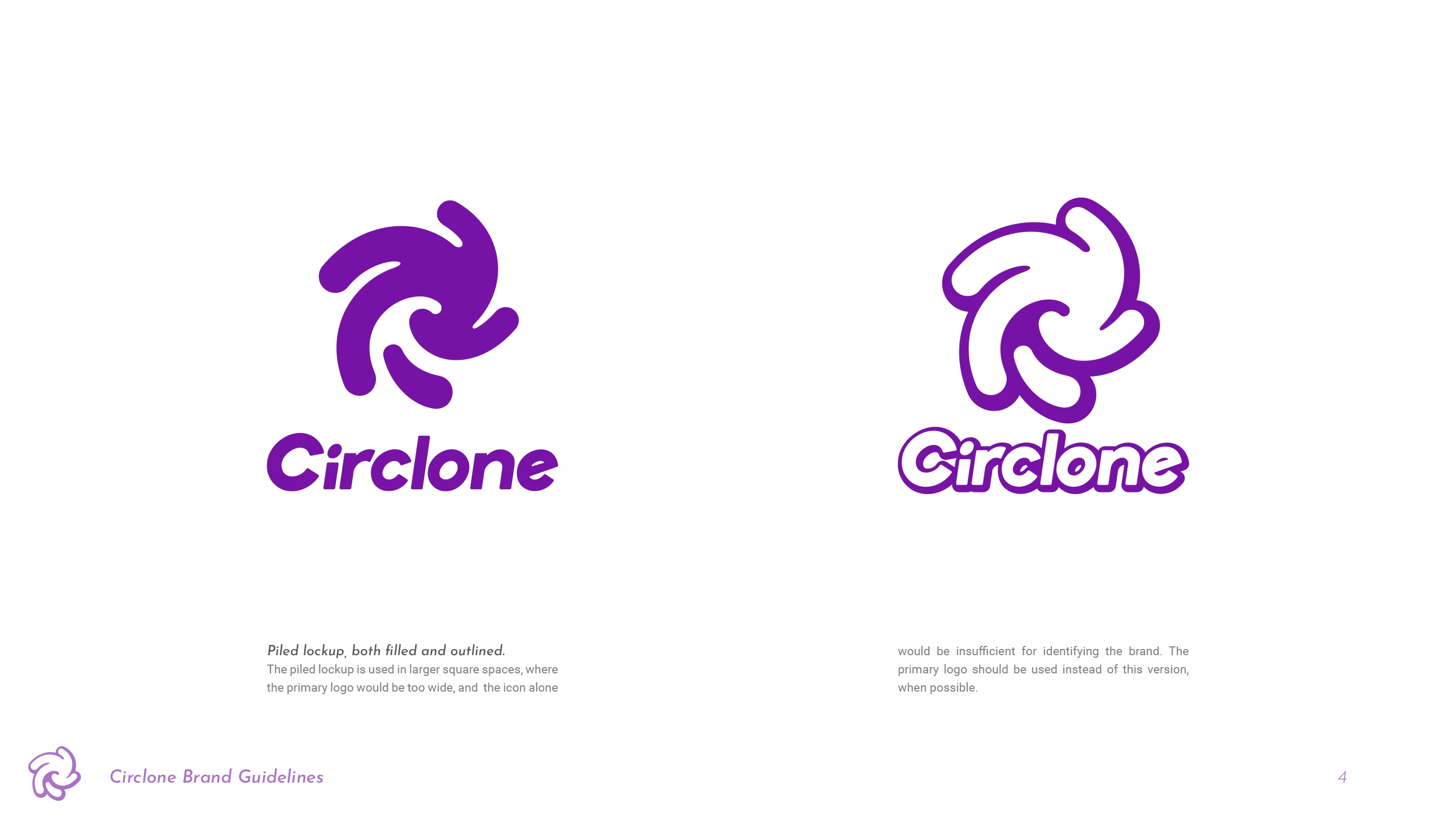


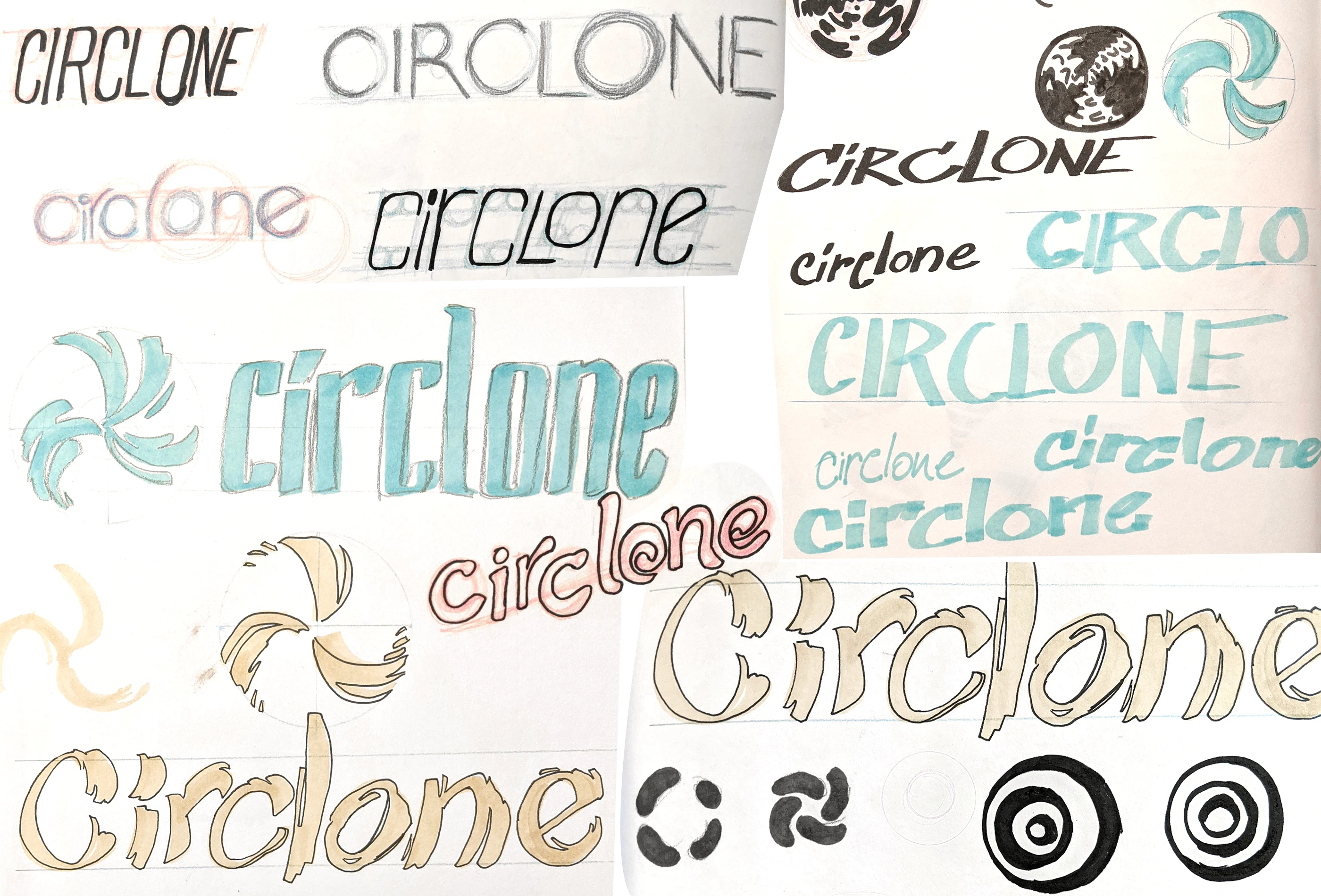
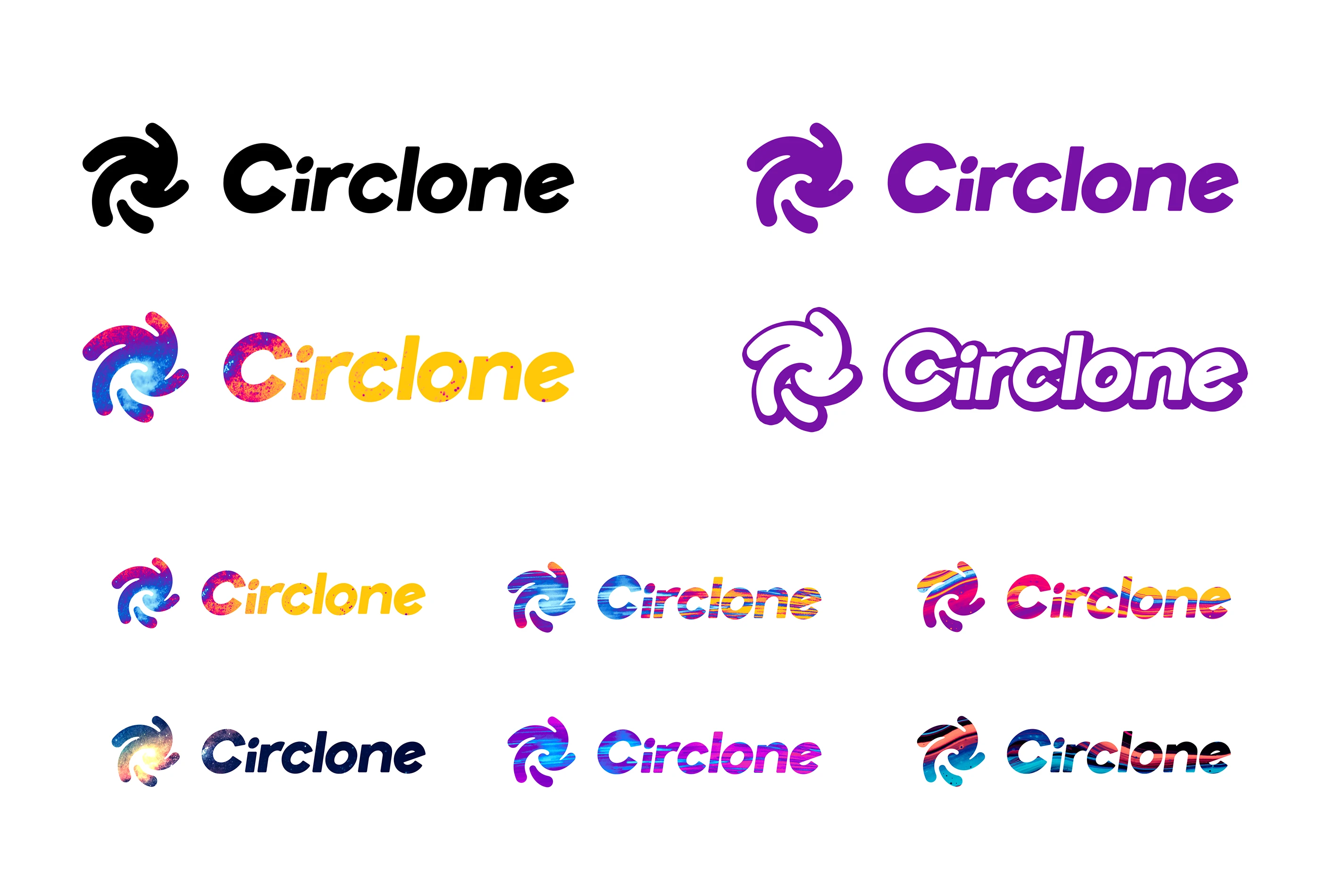
Circlone is a portmanteau of “circle” and “cyclone”. The first thing I did was sketch countless swirly icons, looking for the right mix of exciting motion and friendly vibes.
The typeface had to have a similar feeling. I ended up with a lot of bubbly, flowing, gooey, hippie-looking letterforms.


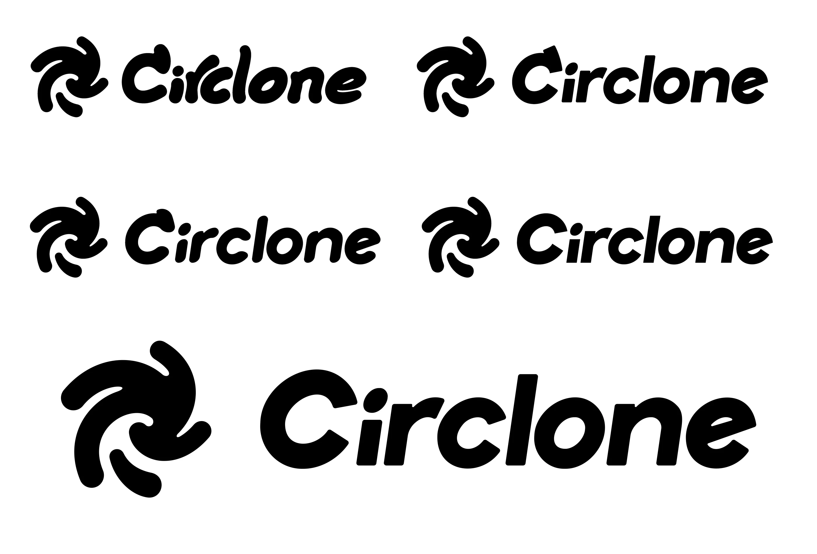
After a good deal of exploration I narrowed in on the right shapes and made a final pencil sketch, then refined that in Photoshop, and further refined the shapes in Illustrator to get the final version.

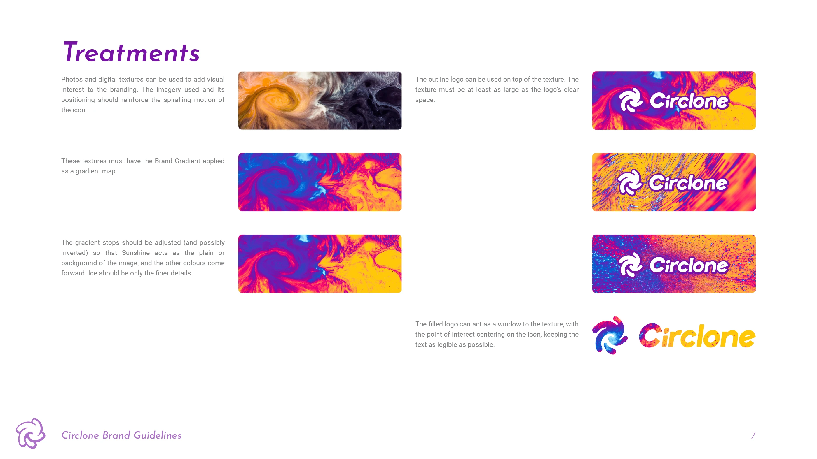
With the shape nailed down I explored colours and treatments.

About a year later I helped with branding their premium offering, Oxygem, and made some 3D animations of their mascot.